City of Helsinki infographics guidelines
City of Helsinki · 2022
A guide collection for producing clear and insightful infographics that follow the City of Helsinki brand guidelines.
Information designGuidelinesAccessibilityConsulting
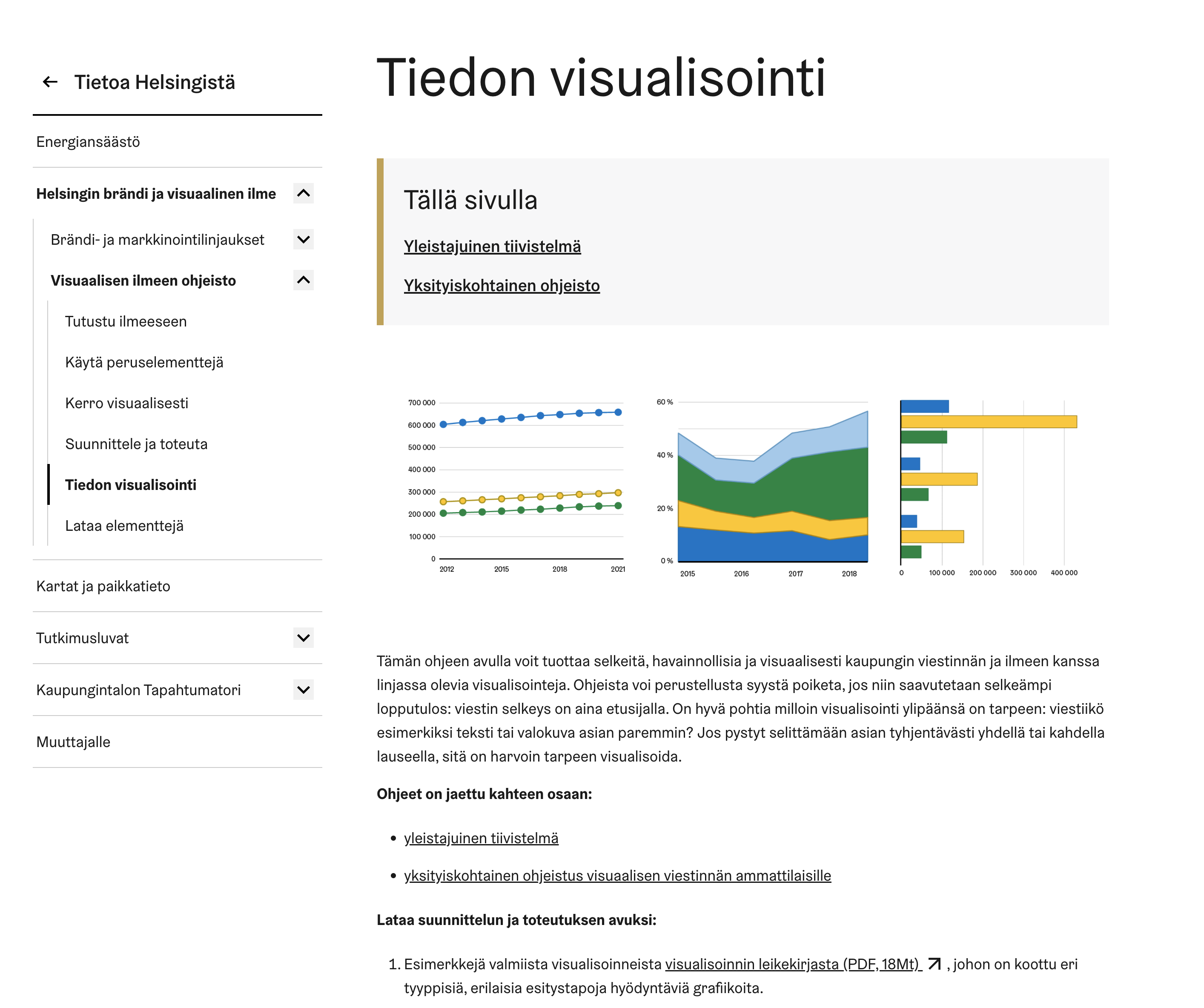
The City of Helsinki data visualization guide (“Visuaalisen ilmeen ohjeisto: tiedon visualistointi”) is an extensive addition to the city’s existing brand guidelines, aimed at helping content creators produce clear, concise, and brand consistent data visualizations in line with the city’s other communication materials.
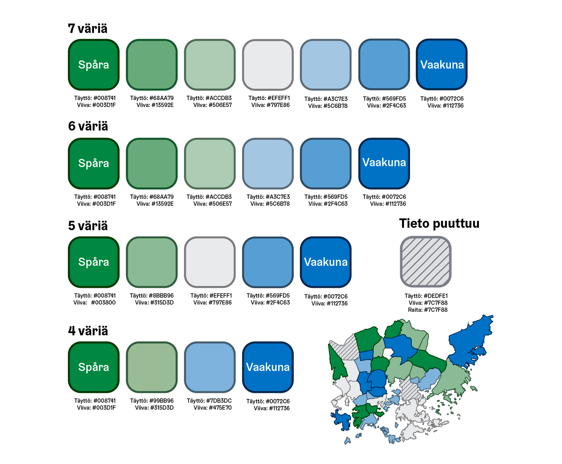
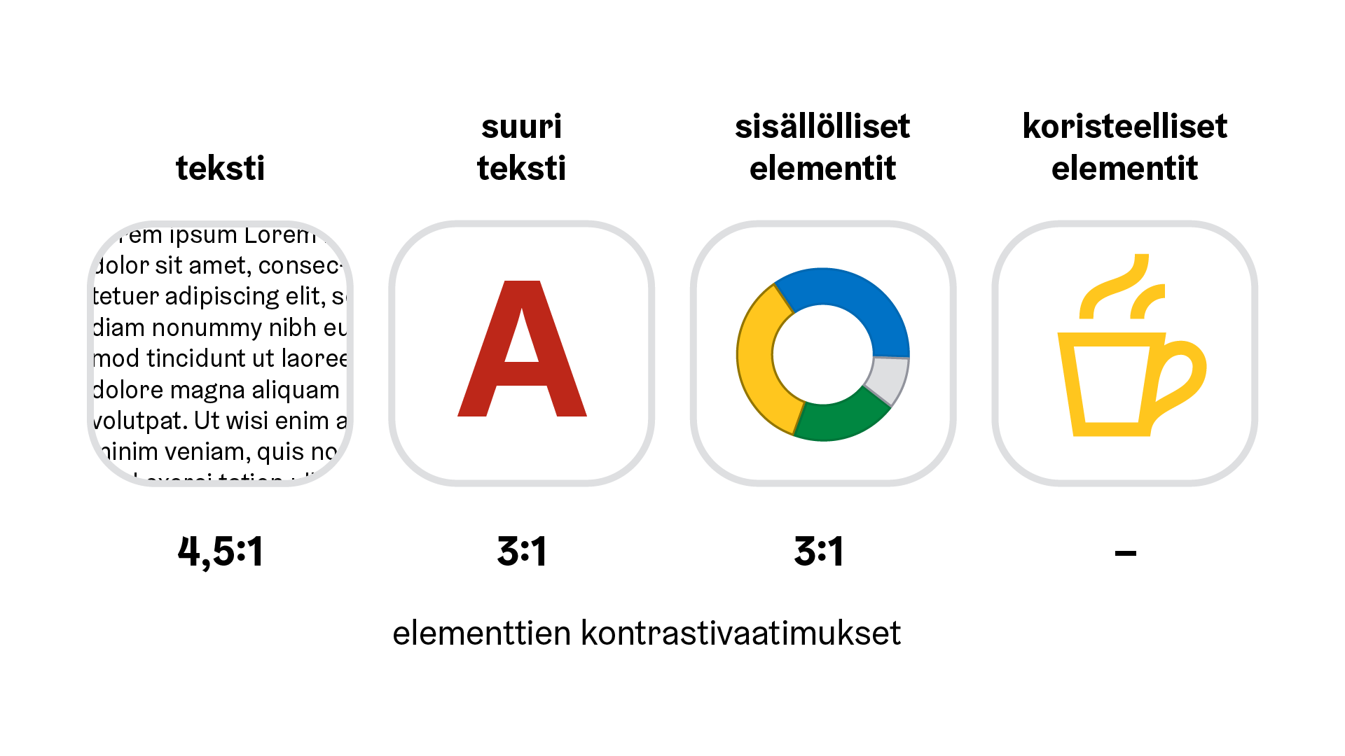
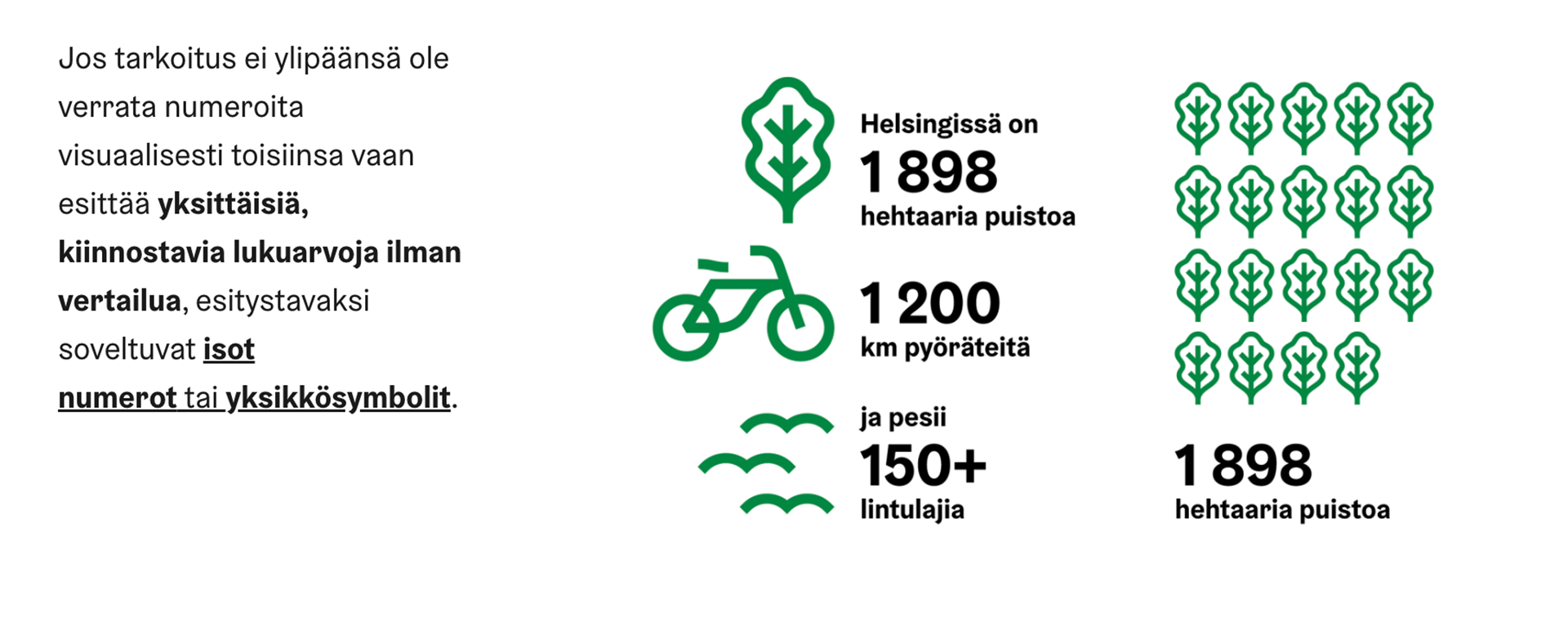
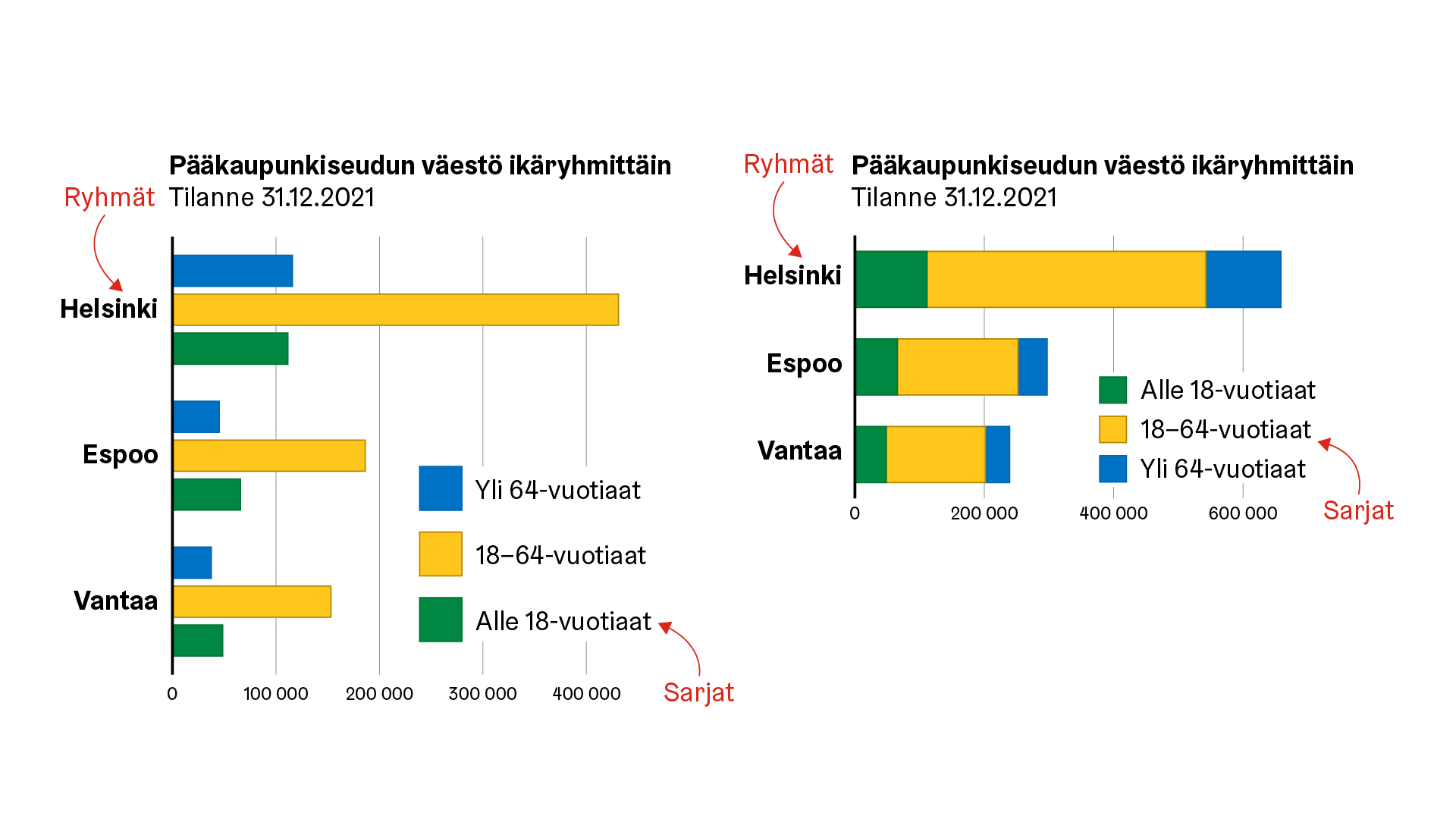
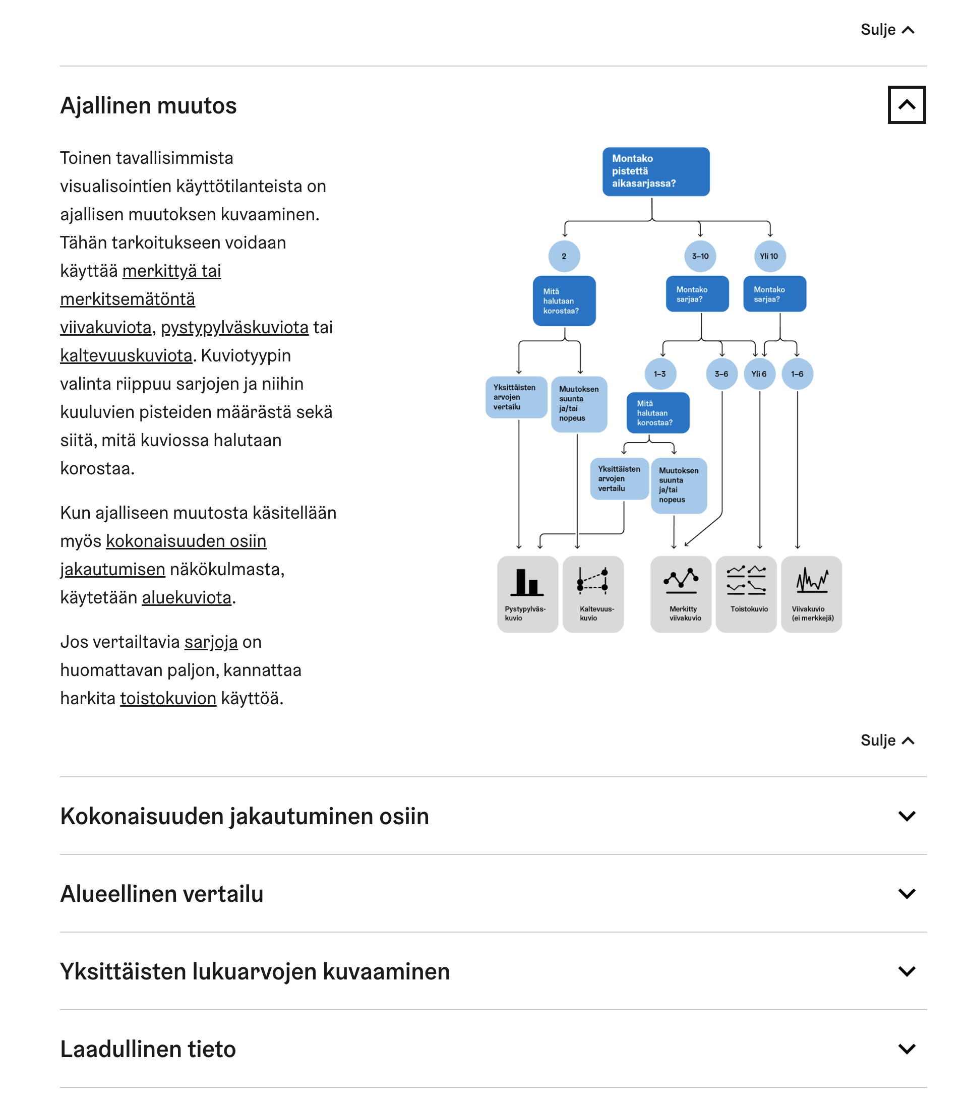
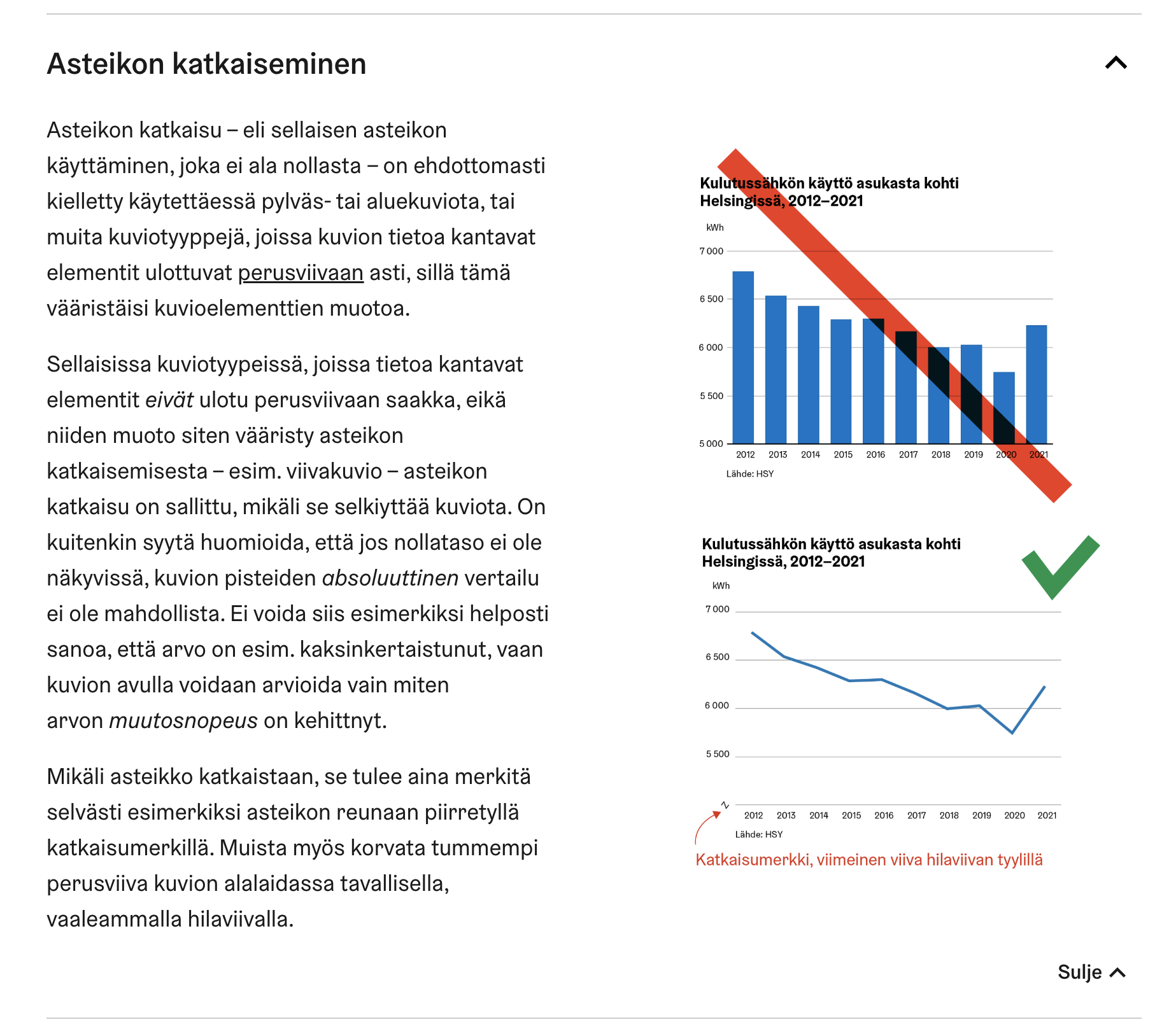
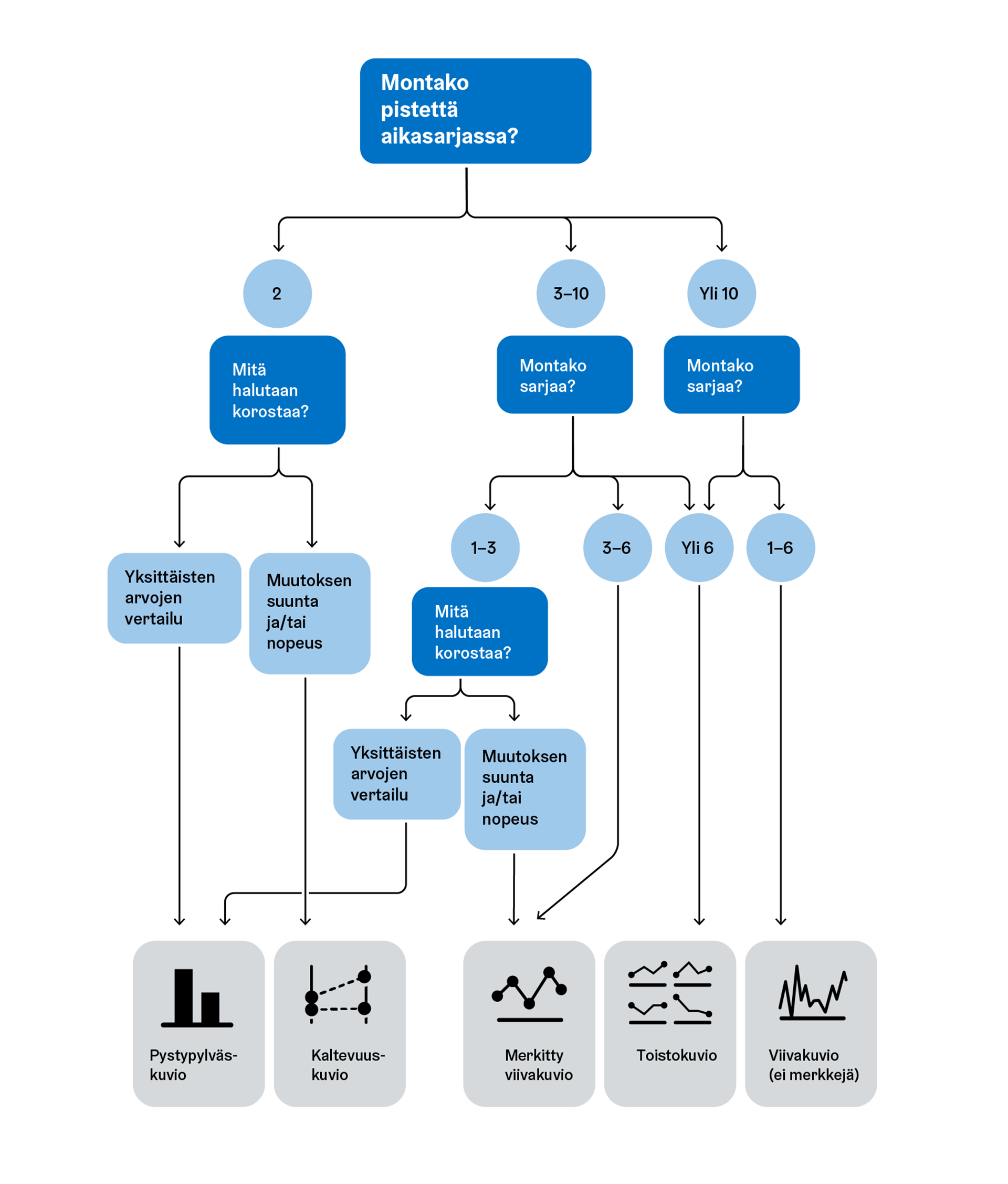
The guide covers general visualization topics such as proper choice in chart type, best practices for common visualization types, ideal layout and content of text elements, as well as use of color, including accessible color palettes. In addition to the guide, the finished package will include Excel chart templates to aid users in creating graphics in line with the city’s brand guidelines and visualization best practices.