SAGE Publications approached us to create a large set of tutorials, called datasets. These would use real-world data to explain and demonstrate good chart practices for a large collection of chart types ranging from commonplace ones like bar charts to animated maps. Each dataset consists of a Student Guide describing the chart and the data and a How-to Guide which provides a detailed instruction to create the chart with specific software.
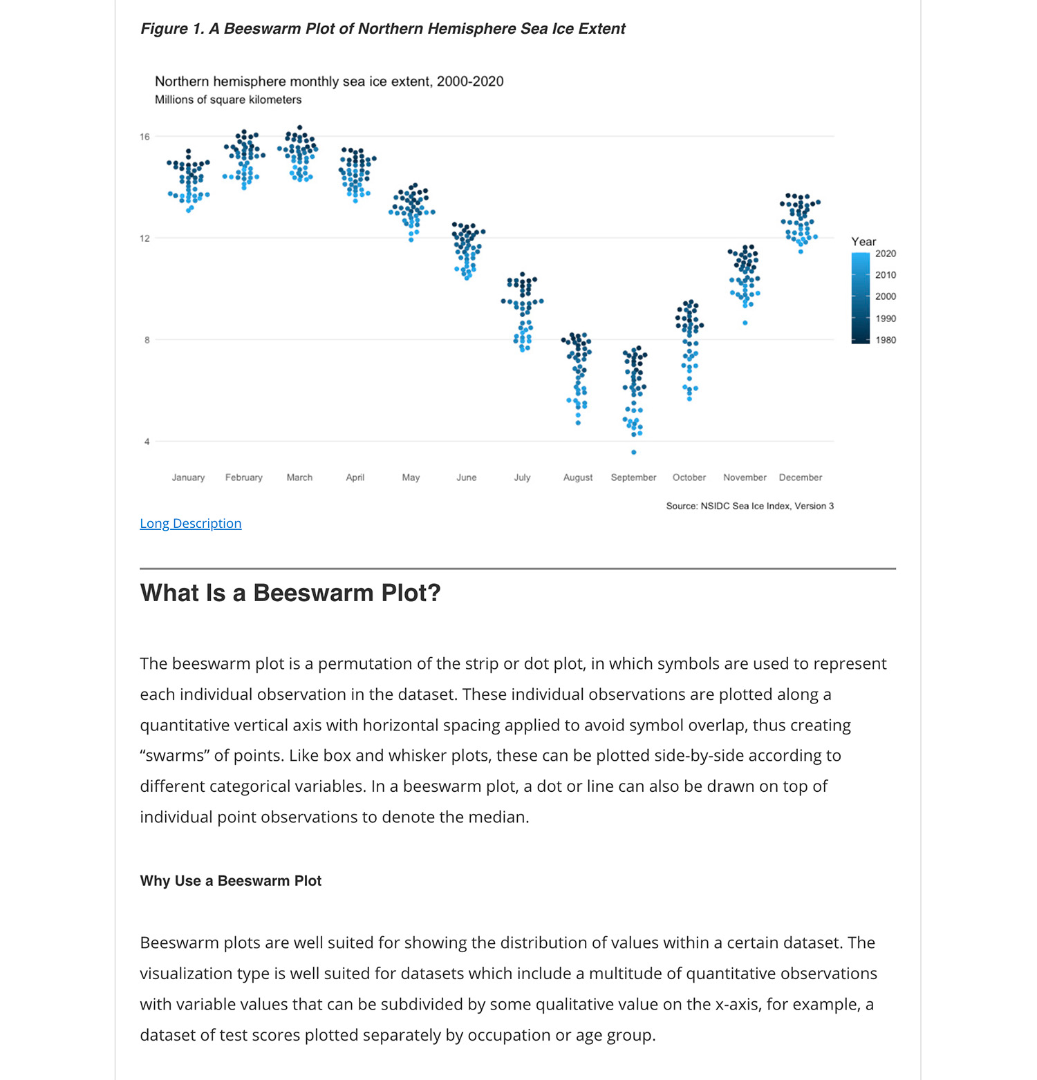
Beeswarm plot visualizing the monthly sea ice extent in Northern Hemisphere
https://methods.sagepub.com/dataset/beeswarmplot-in-nsidc-2020-r
A beeswarm plot created in R. Student guide:
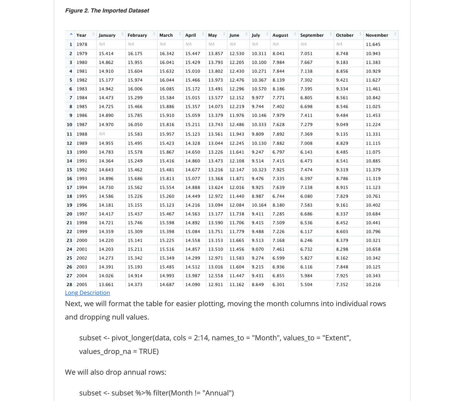
Data table as shown in How-to Guide:
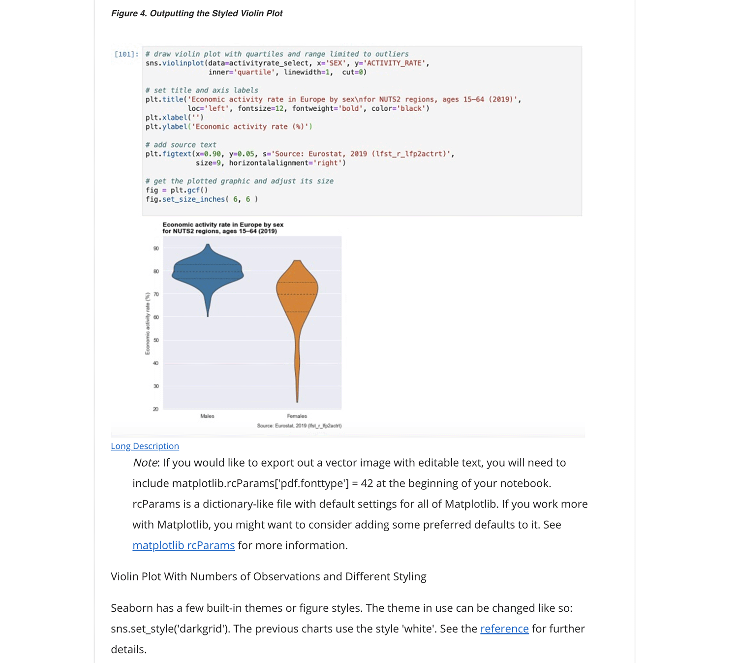
Violin plot of economic activity rate by gender in Europe
https://methods.sagepub.com/dataset/violin-plot-in-eurostat-2019
Example of creating the violin plot using Seaborn:
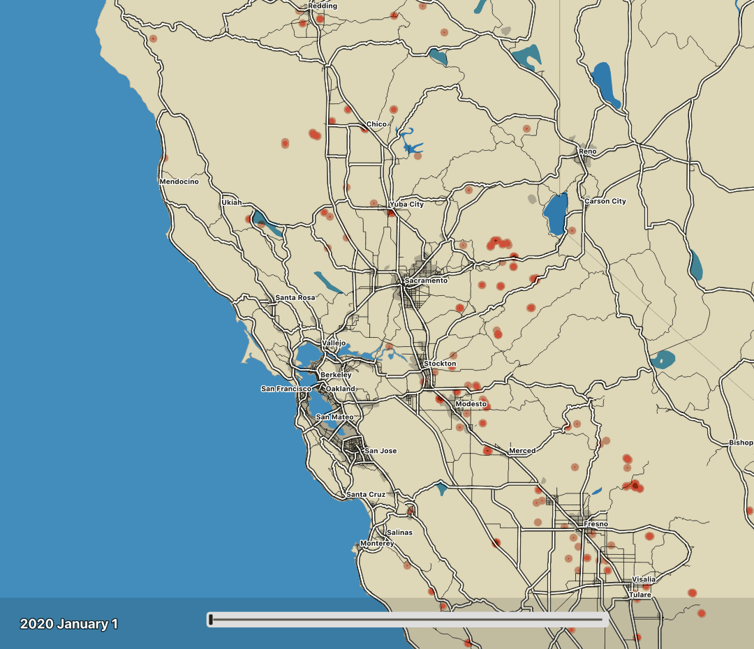
Animated map of fires in California from NASA data
https://methods.sagepub.com/dataset/animated-map-in-nasa-2020
How-to guide for QGIS:
Map as animated GIF:
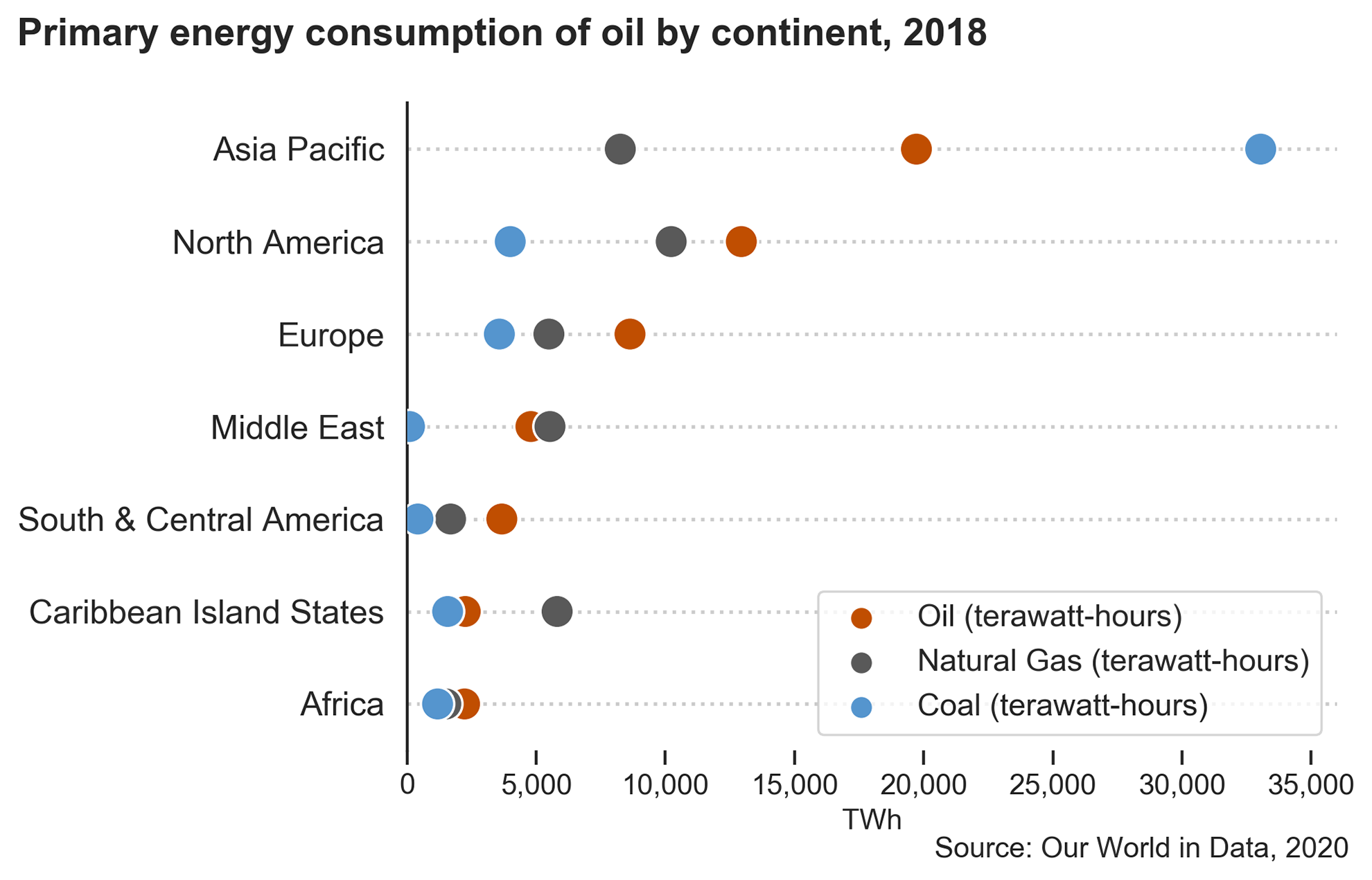
Cleveland dot plot
https://methods.sagepub.com/dataset/cleveland-dot-plot-in-ourworldindata-2018