In Finland, as in many other countries, choropleth maps in which municipalities are colored based on which party received the largest number of votes are traditionally used to show the geographical distribution of votes cast in national elections. Such a map can, however, give a misleading impression of the share of votes received by each party, as Finnish population is very unevenly distributed—in 2017 half of the eligible voters lived in municipalities that constituted less than 4% of the country’s surface area, whereas the least densely populated half of the country accounted for only 5% of voters.
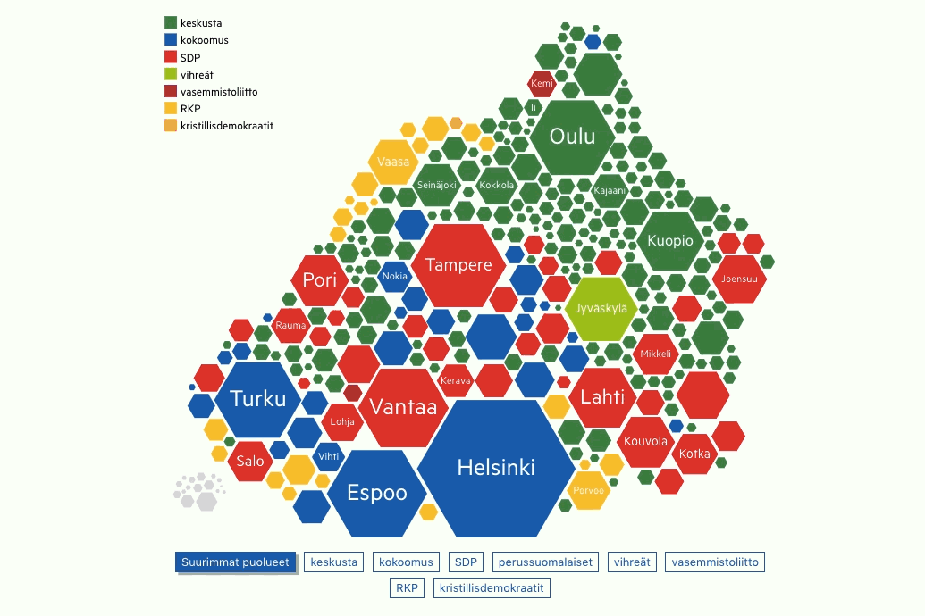
We created an interactive Dorling-like cartogram for Aamulehti, a regional newspaper published in Tampere, to reveal voting patterns that are obscured by the traditional choropleth map. The municipalities are shown as hexagons, whose surface area is scaled based on the total number of eligible voters. The visualization shows, among other things, that the Centre Party (green) which tends to win the largest number of municipalities in each election, in fact fares badly in the big cities, where most voters are concentrated.